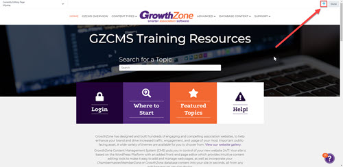
To start adding new content to a page:
- open the Page Editor using the black bar at the top of your screen
- click the + Plus symbol in the top right corner (next to the Done button) as shown to the right
- this will open a sidebar menu of content options that can be dragged out onto the page
- ensure the "Modules" tab within the sidebar is selected
- click the "Group" dropdown within the Modules tab and select "PowerPack Modules"
- click and hold to drag and drop the desired module into an area on the page

Jump to:
Advanced Accordion
The Advanced Accordion works very similar to a standard Accordion (with a clickable title bar to expand more content), but offers additional styling flexibility. This can be created manually using a regular text box or connected to a saved row or module.
Please note that if trying to load other modules or saved Rows or Columns or attempt to iFrame content in the Advanced Accordion you may need to add the following class
skip-lazy
To allow the content to load properly.
Advanced Tabs
The Advanced Tabs works very similar to a standard Tabs (with clickable tabs to organize content), but offers additional styling flexibility. This can be created manually using a regular text box or connected to a saved row or module.
This is the body content. This can be created manually using a regular text box or connected to a saved row or module.
This content would be hidden until the tab is clicked.
This content would be hidden until the tab is clicked.
The Breadcrumbs module allows users to view the page navigation path for where the current page is located within your site hierarchy. You can add this module where you'd like the page path to appear on the page. In order to feed in the path, this also requires a setting to be enabled within the SEO area of your GZCMS Dashboard (steps below), and it is not connected to your menu structure (meaning that pages will all show as Home » Page Title unless they are assigned a "parent page" that should appear after Home in the breadcrumb hierarchy).
To enable the Breadcrumbs setting for use:
- Navigate to the GZCMS Dashboard by clicking on your site name in the black bar at the top
- Hover over SEO in the left side bar
- Select Search Appearance from the fly-out menu
- Open the Breadcrumbs tab
- Scroll to the very bottom of the page
- Toggle the "Enable Breadcrumbs for your theme" setting to Enabled
- Click the orange Save changes button
Example below shows the Breadcrumbs for this current page:
The Dual Button module allows you to place two buttons within the same column block.
Pricing Table
The Pricing Table allows you to create pricing tables in a number of formats
Basic
- Feature 1
- Feature 2
Standard
- Feature 1
- Feature 2
Pro
- Feature 1
- Feature 2
Testimonials
Animated Headlines
Animated Headlines add motion and attention-grabbing visuals to your page. Simply type in your headlines and select from a wide variety of animation effects and styles.
This is a Circle Highlighted Headline!
This is a Curly Highlighted Headline!
This is a Headline!
This is a Headline!
Countdown
The PowerPack Countdown module works the same as the standard countdown (where you set an upcoming date and a countdown will appear), but includes additional styling options and field label controls.
Countdown Title Here
Flip Box
The Flip Box module allows you to set different content to display when the visitor hovers over an area.
Front Title
Front Description
Back Title
Back content can go here!
Logo Grid & Carousel
The Logo Grid & Carousel module allows you to organize a group of logos or images into a grid or scrolling row. Each logo can be linked to a page or URL, and you can adjust the speed, number of logos per row, pagination dots/arrows, hover color saturation, borders, and backgrounds.
Carousel

Logo

Logo

Logo

Logo

Logo

Logo

Logo
Grid

Title

Title

Title

Title
Time Line
Tell your story with a beautiful timeline.
Start
Lorem ipsum dolor sit amet, consectetur adipiscing elit. Mauris fermentum diam tortor, aliquet vestibulum sapien cursus ac. Donec egestas aliquam dui vel tincidunt. Nunc ultrices euismod libero a imperdiet.
MIddle
Lorem ipsum dolor sit amet, consectetur adipiscing elit. Mauris fermentum diam tortor, aliquet vestibulum sapien cursus ac. Donec egestas aliquam dui vel tincidunt. Nunc ultrices euismod libero a imperdiet.
End
Lorem ipsum dolor sit amet, consectetur adipiscing elit. Mauris fermentum diam tortor, aliquet vestibulum sapien cursus ac. Donec egestas aliquam dui vel tincidunt. Nunc ultrices euismod libero a imperdiet.
Modal Box
The Modal Box is a great way to organize content so it is hidden until the desired popup window should open. You can set a popup modal window to open after a certain time delay, on exit intent, or on click using a button, image, or icon.
Button Click
Image Click
Icon Click
Image Carousel
The Image Carousel module is another alternative to a standard slideshow or gallery for displaying images. It allows you to select a few style and animation options, and you can set how many images to display at once.


